Inspiration
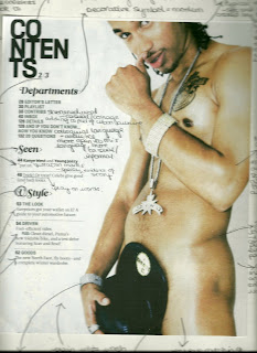 I started to generate ideas for my contents page by looking at layouts of other magazines with a similar audience to mine. The most helpful to me was Vibe magazine. I deconstructed this contents page to begin with, which helped give me ideas for my own contents page. For example, the way in whcih the contents title is layed out makes the page look modern and stylised as well as casual. Hence, I decided to do a similar thing with my own title. As well as this, I liked the way in which the text was surrounding the image and the imaged is the main part and focus of the page. I decided to do this with my own contents page, I decided this having looked at contents pages from magazines such as Clash. This was the other contents page I decided to deconstruct. Comparing the two contents pages helped me to generate ideas for my own page since I decided that I was not a fan of the layout of the contents page from Clash. I felt that Clashs contents page was too formal and the layout and structure was too apparent, compared to Vibes contents page which was a lot more simple and any layout boxes used to help are no longer visible, helping it look more casual.
For my own contents page, I wanted to create a more modern look, similar to that of . As well as this, I looked at the kind of headlines used by the contents pages. I liked the way in which had I started to generate ideas for my contents page by looking at layouts of other magazines with a similar audience to mine. The most helpful to me was Vibe magazine. I deconstructed this contents page to begin with, which helped give me ideas for my own contents page. For example, the way in whcih the contents title is layed out makes the page look modern and stylised as well as casual. Hence, I decided to do a similar thing with my own title. As well as this, I liked the way in which the text was surrounding the image and the imaged is the main part and focus of the page. I decided to do this with my own contents page, I decided this having looked at contents pages from magazines such as Clash. This was the other contents page I decided to deconstruct. Comparing the two contents pages helped me to generate ideas for my own page since I decided that I was not a fan of the layout of the contents page from Clash. I felt that Clashs contents page was too formal and the layout and structure was too apparent, compared to Vibes contents page which was a lot more simple and any layout boxes used to help are no longer visible, helping it look more casual. used subtitles for its headlines such as 'V Style'. This obviously indicates that creates trends, thus giving the magazine a higher status as well as relating to its trend setting audience. I decided to do something similar with my own contents, 'The Blast Look', this creates a similar effect but instead creates an entire 'fashion' associated with my magazine, thus raising its status and helping it stand out in its genre. Looking at the two contents pages also helped me to come up with the idea to seperate my headlines into subcatagories - 'This Month', 'The Blast Look' and 'News, Tunes & Reviews'. As well as this, they gave me the idea to simply keep page titles to two or three words, creating catchy headlines that could potentially be used as 'regulars' in my magazine. As well as this, I decided to put a short description beneath said headlines. I only did this to headlines that required explanation and headlines that were not regular features. For example, each headline in the 'This Month' catagory have descriptions since they are features independant to that months issue and people will not be familiar/instantly know what the article consists of. I did not do this for regulars that do not require explanation such as 'News' and 'Latest Releases', headlines such as 'Brands' were left without description so as to indicate that they are regular features and that the magazine assumes you are a regular reader who will already be familiar with the features.
The contents page also gave me the idea to use capital letters for the headlines, helping them to stand out and discouraging them from blurring into one. This then gave me the idea to make the descriptions entirely in lower case, contrasting the two and creating a stylised look. I also liked the way in which the catagories has been written in italics, I decided to use a swirly and decorative font since such writing is favoured by artists of my genre, thus associating it with my chosen genre of music. This font style has been used by several artists relevant to my genre, for example:


 I also decided to include the month and year of the release of my issue on my contents page, as has been done on the Clash contents page, thus making my page look more proffessional. As well as this, I also
decided to include the Issue number of the magazine again to create a more proffessional look.
Making My Contents Page
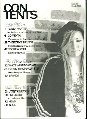
 This is the image I decided to use for my contents page.
I took this image since it looks urban and informal, which is exactly the look I needed for my magazine. My models casual clothes and pose also contrasts and differs to that of my dressed up model on the front cover.
I inserted this image into Adobe Photoshop to edit it for my contents page. I began by using the magic selection tool, selecting the parts of the image I no longe
 r wanted. I selected random parts around the bricks so that instead of getting a square box shape around the image, I created uneven brick shapes around the image, creating a more effective and interesting image. Having selected the parts of the image I no longer wanted, I selected Adjustments > Levels and then adujsted the levels so that my selected area turned white, fading it into the background.
 Having successfully selected the part of the image I wanted to keep, I cropped the image so I was only left with what I needed and no longer had excess background surrounding the image. I did this by selecting the crop tool and dragging the selection box around the part of the image I wanted to keep. I then right clicked on the highlighted section and selected crop. Next, I again used the magic selection tool to select the part of the image I wished to edit. I then selected Adjustments > Levels and arranged the dial to give my model a more glowing, airbrushed look.
Next, I selected Image > Adjustments > Black and White. I added this particular effect so that my contents would coordinate nicely with my cover, t
 hus giving my magazine a kind of theme. I selected Maximum Black to help the shadows of the image to stand out and creating a bolder, more effective image. To add to this shadow effect, I next selected Adjustments and then Shadow/Highlights, adjusting the dial until I had created my desired effect of making the model stand out against the background and creating a more polished look.
 I used the Eye dropper tool to select my models correct skin tone. I then selected the Brush tool and clicked on the Brush icon shown in the image so I could select the Airbrush tool. I then used this tool to touch up my models face, making her skin look absoloutely flawless as the airbrushed look is very popular amongst artists of the R&B genre. I then used the same brush tool in black to add eye make up to my model, simply by outlining her eyes makign them stand out more. To make sure both these effects looked as natural as possible and as if they were there whe
 n the image was taken, I selected Edit and then Fade, adjusting the dial to the point that the effects were noticeable but did not look computerised.
Once I was done editing my image, I opened Adobe InDesign so I could create my actual contents page. First, I used the Picture Box tool to create an idea of where to position my image. I then selected File > Place selected my image file so as to insert it into the box.
 To make my image fit the box without stretching it and making it look out of proportion, I right-clicked the image and then selected Fitting > Fill Frame Proportionally. This prevents the image looking blurry when inserted.
 I decided to have the image going slightly off the page since this creates a nice effect as well as leaving room for the contents page text. Doing this also prevents an unnecessary excess amount of bricks being on the page. To move the image without moving the frame I used the hand pointer to move the image around within the frame and position it into an effective and attractive position.
I also changed the transparency of my image so that it would fade slightly into the background so that although the image would be a large feature of the page, it would be more of a background to the text. I also did this so that the image could have some text on it, creating an informal and almost 'thrown together' effect. This also creates an artistic effect and keeps more attention on the text than on the image. I achieved this effect by rick-clicking the image, then selecting effects, and then transparency. I then adjusted the percentage of transparency until I felt the image looked its best and I had achieved the desired effect.
 I made my image this amount of transparency so that it is still strong enough to be seen and isn't too faded into the background to be insignificant to the page, yet still transparent enough to be seen as part of the background and not pull too much focus. It is also transparent enough for text to be overlapping slightly onto it and still be visible.
I inserted the text using the text box tool and dragging it into what I felt to be the appropriate area. I decided to put the title in the corner as oppos ed the centre so as to make a point of the fact that the text was on one side of the page. This also made the page look neater and more coordinated and thought out. Given my layout of the title this also made it look as though the title had been compressed into the corner, giving a modern and casual look. I kept the page listings in one text box so as to keep all the text aligned and neat. However, I did insert the word 'Contents' into a separate text box so that I could experiment with its positioning around the page and so that I could adjust how close it was to the page listings and image. I also did this to keep it separate from the rest of the text and in a slightly different alignment.
 ed the centre so as to make a point of the fact that the text was on one side of the page. This also made the page look neater and more coordinated and thought out. Given my layout of the title this also made it look as though the title had been compressed into the corner, giving a modern and casual look. I kept the page listings in one text box so as to keep all the text aligned and neat. However, I did insert the word 'Contents' into a separate text box so that I could experiment with its positioning around the page and so that I could adjust how close it was to the page listings and image. I also did this to keep it separate from the rest of the text and in a slightly different alignment.
I decided to lay the contents title out like this because the vibe contents page I deconstructed had a very similar design (and audience) so I felt it appropriate as this is clearly the most fashionable way in which to layout such a title. This also adds to the informal feel of my page.
By adjusting the text options I made the bottom and top text closer together (the 'Con' and the 'Tents') so that it is made clear that it is all one word. This also gives it a more modern and youthful look/layout. I also adjusted the text options by making the letters wider, this stretched the text out a bit more and made it full more space without having to actually alter the font size. I did this because I liked the size and positioning of the text but it wasn't quite filling up enough space and didn't look quite right so far away from the image. I therefore adjusted it until I felt it looked appropriate. I also made the letters fairly close together so as to make it look modern and stylish as well as making the text fit into the amount of space provided.
 I did the categories in an italic and decorative font so as to separate them from the rest of the text and because of the before mentioned connotations of such a font. This also helps give the page a more attractive look. I did the page headings in capitals to separate them from the descriptions and again for the before mentioned reasons. Contrasting to this, I did the descriptions in lower case for a modern and stylish look. I chose a simple and almost plain font so as not to overcrowd the page and make it look too 'busy'.
Feedback from others helped a lot with the creation of my contents page. Most were very happy with my finished product and the main suggestion I got was to include the the date. I decided this was a good idea because as I mentioned earlier this has been used in other magazines such as Clash. I developed this idea by also including the Issue number of the magazine. Since magazine pages frequently end up on the Internet, I included this to show exactly when the magazine was created and which issue it is, creating a more professional and realistic look. I put this feature in the top right hand corner, sort of away from everything else. I did it in plan writing and did not use any stylish features, I did this so as not to pull away any focus from the rest of the information on the page because for obvious reasons it is not the most important part of the page.
 Final Product.
No comments:
Post a Comment