Tuesday, 20 April 2010

Deconstruction of Double Page Spread

I used a simple line at the top and bottom of the page as a border since this is neat and keeps the focus on the images and text and does not overcrowd the page. The border makes the page look more neat, professional and complete. It also creates a style for the magazine and looks like a template, suggesting that this is the standard layout for the magazine. I got the idea for this from the Lily Allen spread in Q. The simplicity of it makes the page look simple and not too fussy, implying the artists state of mind as being simple and together after the last few months of chaos! I did not make this the same colour as the line beneath the title because this made the page look washed out and tacky. The black makes it look bold and helps it to stand out without being too attention grabbing. It also coordinated with the black and white of the images, making it look tidy and sophisticated.

I added this picture within the text simply as another feature and to liven the page up. I also did this so that people will be able to see the connection between the article and the picture of the artist on the cover. I put a short description beneath so that the image did not look completely random and also to show people the link. I felt this gave the spread a more professional look and it also helped any readers who may not be completely familiar with the artist (new readers of course!) and to refresh peoples memories. I used colloquial words in the description to appeal to my audience and keep the text as short and neat as possible, (e.g. referring to '2009' as '09'). The image is black and white to keep this theme going and to not make it stand out too much, to help it coordinate and not look out of place.

I separated each question and answer so as to make my page neat and tidy. I also did this to make it more simple to read and to improve the layout. I made the questions bold to help them stand out against the answer, again making the page easier to digest. I used a very plain and simple font so as not to overcrowd the page and also to keep the focus on what is being said as opposed to any visual stimulator's.


To open my article I described the scene so as to allow readers to create an image of the interview in their head since there are no visual stimulants to help them along the way.
I did this in the same font as the title and description so as to show that it is not part of the interview it is simply to do with the opening and the words are purely the writers.

I put a short description beneath the title since I noticed when deconstructing other music magazine double page spreads that this is often done. I made the artists name bold simply to make it stand out and highlight both her importance and separate the name slightly from the rest of the text. This also looks good since it is right in the centre! I centred the text so as to make it look like a title in its own right and also simply to make it look more neat and tidy (a layout requested by my target audience).
I added a line beneath this just to separate it from the rest of the text and to coordinate with the border. I also did this to give a professional look and to add another feature that I could use to add a subtle hint of colour to my page. I coordinated the colour of it with the speech marks in the title to make my page look coordinated and neat.
For the title, similarly to the headline on the front cover, I used a quote from the article itself. I did this because I felt that it would create a simple and effective title, whilst avoiding anything cheesy! I also did this so that readers get an impression of the nature of the interview, even if this may not be an entirely accurate impression. The quote I pulled out of context suggests that the interviewee is being perhaps either self righteous and a bit rude, or is being strong and confident. This encourages my audience to read on due to intrigue and the want for gossip.

I enlarged certain words of the quote for the same reason as I did for my front cover. To highlight the important words that give away the message of the quote, as well as creating an interesting and attractive feature on the page, making it look more styled. I did the entire quote in lower case to show it's been pulled out of context mid sentence and again to make the page look styled and attractive, creating a casual and informal look - appealing to my target audience and adding to the image of the artist I was trying to create.

I changed the font of the speech marks to make them look more robotic and modern in comparison to the rest of the text to make them look more modern and stand out. This highlights that the title is a quote as well as creating a modern and youthful feature. I also only wanted subtle bursts of colour, so as not to make my page look like a tacky combination of colour and black and white. Pastel colours can also look particularly tacky amongst black and white, whilst bright colours look too techno and neither were looks I wanted to create. I chose this colour because the combination of yellow (connotations of happiness and warmth) and pink (connotations of youth and femininity) suggest happiness and youth! Two of the main ideas about the artist that I wanted to get across to my reader.

I chose this simple and sophisticated font since sophistication and togetherness were also amongst the ideas of the artist I wished to convey.

As most magazines do, I wrote on my page the writer of the article and the photographer of the images. I noticed whilst deconstructing my double page spreads that instead of just putting 'written by:' or 'photographer:' they often use words that would appeal and fit in with their readers, for example 'portraits:' as opposed to photos. I decided to do a similar thing, using a mixturee of colloquialism and slang - both of which are used by my target audience and therefore fitting in with the rest of my magazine. I wrote 'words' and 'snaps' in writing coordinating with the rest of the page and in bold to help them stand out and wrote my name in the same font but in italics simply to detach and separate it from the rest of the text. Another reason for the use of bold is so that I would not have to use a colon, making my page look messier. This way even the smallest of detail is kept tidy and styled - fitting in with my readers attention to detail!

I created a sort of logo using the B from Blast and the font from my masthead, helping my readers familiarise themselves with the font and hence forth associate my magazine with it. I also did this to brand my spread and put my mark on it, I also did this using the date, should there be any future reference to the spread. This also give the spread a more professional look, similar to the double page spreads of Q Magazine. I wrote this beneath the border to as to give the appearance of a template, again creating a more professional look and giving the impression that double page spreads a regular feature of my magazine.

I laid out my photos in a photo booth format. This makes it seem as though they have been taken one after the other (which they had!), creating a natural and casual look for the model.

Since my main story was based around some moody pictures taken of the model on the 'red carpet', photos that she wasn't aware were being taken, I thought it would make a nice contrast to have a similar scenario in which my model was unaware the photos were being taken, only this time she looks happy and relaxed! This shows the change in her from when the red carpet photos were taken and the present!

I dressed my model in casual and fashionable clothes, although they are not in full view, you can see the top of her denim shirt and stripey top. These are both fashionable items of clothing as well as being informal and seemingly not particularly though through, creating a look relaxation and creating a contrast against her formal lace dress in the front cover photo.

Whilst ordinarily an urban music artist may be more likely to look, unsurprisingly more urban and street than the look of my model, here I am challenging this stereotype and showing that sometimes these artists are not just about the 'look' and the lifestyle, but sometimes about the music. My models dressed down look and casual and perhaps more typically indie hairstyle.

I wanted to recreate the more casual and natural yet classy look of other urban music artists such as Beyonce:


Sunday, 18 April 2010

My Pre-Liminary Task

For my pre-liminary task I had to produce a front page of a college magazine, complete with medium close-up of a front page model. I had to create a realistic and effective magazine for my target audience (college students) by creating headlines and an effective and catchy masthead. As well as this, I needed to create a contents page, making sure I included some of my own images. After this, I needed to develop and evaluation that included how my magazine presented teenagers, who my target audience was and how I've attracted them with my product, plus the skills I'd picked up along the way.

Looking back over my pre-lim, I can see how my skills have developed over the year. Obviously my skills using programs such as Photoshop and InDesign have developed greatly, this is clear to see simply by looking at my pre-lim product and then at my final product! My deconstruction skills have also developed. This is clear by looking at my evaluation. Whilst I covered a lot of ground on why I had done certain things, I had failed to come up with helpful products such as a reader profile, which I created to complete my music magazine. This prevented me from deconstruction certain design features for example why I had created long headline descriptions or laid the front page out in the way that I had. I also use a lot more detail in my deconstructions and evaluations now. In my pre-lim my evaluation does not go into quite enough detail in describing and explaining my motives behind certain features, although I do cover the basics for example why I took a picture of a 16 year old girl for my cover - to appeal to others of her age which is my target audience etc. Whilst I managed to cover the basics I did not go in to detail as afar as I did for my music magazine where I was able to describe why I used certain colours and why I included everything including particular people.

After creating my pre-lim I learnt that planning is an absolute necessity. When creating my pre-lim, I did not do a lot of planning, if any. I did not plan the layout nor the pose for my model I just threw myself into it. This was a good lesson to learn in preparation for my final music magazine, where I planned everything from the pose of my model to her clothes and positioning. This helped ensure I created the product I had in mind and gave me time and opportunity to develop my ideas to the best that they could be. This also gave me time in the long run to play around with features and so that they were the attractive and appealing to my target audience.

Similarly to planning, research played a huge role. I did not do a lot of research for my pre-liminary magazine and instead used the knowledge I already had of my target audience and what they may find appealing. This restricted me to only creating the simplest and most basic product for my target audience. However, when creating my music magazine, I researched what my audience were interested in by conducting a survey (the results of which are recorded in both written and graph form in my scrap book, but I no longer have access to due to a broken USB stick - the results I do have in graph form however are in previous posts!). This gave me feedback on everything from where they holiday to what they drink. Thus helping me create a product which was exactly what my audience wanted from everything from artists to include and even the kind of layout and colour scheme they find most appealing! Creating a reader profile also helped me produce the perfect product for them.

By deconstructing other music magazines double page spreads, front pages and contents pages, I was able to get an idea of what my audience look for and what magazine pages typically look like (I then had the option to conform to this or to make my pages different). Whilst I looked at some magazine pages for guidance for my pre-lim, I did not specifically look at college magazine pages in the way that I looked at music magazines with either similar genres to mine or just in general, for my final magazine product.
Constructing my pages also became a lot easier. This was obviously because when I created my pre-lim I only had the basic guidance from my teacher to know what I was doing, I had no idea how to use Photoshop and had only used some features such as inserting text and pictures into InDesign. By learning the basics on my pre-lim, I was given therefore given time to develop my skills by playing around with the programs and seeing what tools I liked using and how I could use them to the best of my ability. Therefore it was only natural that my final products be a lot more developed, effective and professional looking to that of my pre-lim!

Technologies

To develop my music magazine, I've used a variety of new technologies from Photoshop to photoshoots, most of which I have never used before.


To make a record of my progress, I've of course been blogging on http://www.blogger.com/! Although I had never used a blog before, it was very easy to pick up and most of the steps come with instructions and clear labels (how to start a new post, how to save and publish, how to change the layout and template, how to view your blog, and so on). I did not find using the blog challenging although it was new to me, because the tools were very easy to follow and the steps very easy to understand! I've picked up skills along the way regardless of this, for example uploading pictures and editing the colours of my template as as to create an attractive and easy to read blog.


To create my actual pages, I used Adobe InDesign. I had used this program before at GCSE level and therefore already knew the basics of it (how to insert text and images etc.) but to make my music magazine as proffessional looking and as good as I could make it, I needed to develop my skills further. To do this, I first created my Pre-Lim which helped me learn how to use InDesign when creating a magazine page (all the times I had used it, it had never been for this purpose!). This helped me learn where to position text and images and how to fit images proportionally. When creating my actual music magazine, I developed skills such as editing the actual images and text, which I had never done before. For example on my front page, I managed to rotate the text slightly (on my quote) and on the contents I learnt how to make the image a certain degree of transparency. I managed to pick up my skills simply by playing around with it as I went, by creating my Pre-Lim and by taking advice from my teacher (who also went through the basics with us).


To get my images, I had to conduct a photoshoot. The backdrop and lighting had been set up for me but I was able to play around with the lighting and camera in order to get the images I wanted. For my front cover image, I played with the lighting by making it travel up her body, shining off her face, creating a paparazzi effect (the conclusion was that the lighting looked like it was almost flashing up and around her - like a series of cameras). By using hand held camera I was also able to get different shots of her body and from different angles so that I gathered a wide selection of images to choose from - enabling me to end up with my perfect photo. I found this part of the development very enjoyable and it helped me develop many skills. For example, playing round with the positioning of the model helped me to learn how to communicate what it is I want to other people and work with others to get it. I also learnt how to correctly use a professional camera, how to zoom in and out and how to position myself to get the most effective angles.


When taking my contents page images, it was a lot more casual. I used a digital camera because I took the images in my free time. I simply made my model put her hood up and stand up against a wall with her hands in her pockets. This instantly created the urban and casual effect I required and again this helped me communicate effectively to others what it is I'm picturing.

My double page spread images were taken in a similar fashion to that of my contents. I wanted these to look informal, unlike my front page image, so again took them using a simple digital camera. Doing this helped to add to the 'photobooth' effect I was trying to achieve. By simply getting my model to laugh and taking a series of pictures of her, I was able to instantly and easily achieve the effect I wanted. Again, this helped my communication skills. This photoshoot was a lot more challenging than the others since I had to get my model to laugh! Luckily I had friends on set behind me to help get the natural and relaxed smiles from her. This also helped me gain skills using a camera, since it was not a professional shoot like the front page, I did not have a proper backdrop, nor did I have any proper lighting, I therefore had to improvise with a white wall and the camera flash. This helped me learn to work with what I've got and get the most out of it!


To develop my images I used Adobe Photoshop. I'd never used this program before and a lot of it was quite difficult when beginning. For example, using the new tools correctly and in an effective way was hard at first when I didn't know what tools it was I needed to use or what would give the best results. I managed to work my way around it firstly by creating my Pre-Lim, which gave me at least a vague idea of the basics of Photoshop, (it's clear from my print screens that the magic selection tool came in handy quite frequently!) by playing around with it as I went along (this is how I discovered tools such as the airbrush) and by taking advice from my teacher (who obviously knew a lot more than me). By discovering the basics, I was able to experiment more and gain the most from this program.


At first, I found Photoshop very difficult to use, again because it was completely new to me. All the tools and symbols were very daunting at first but because I'd had time to try and work my way around it before creating my actual product, simply by editing my Pre-Lim photo, it was a lot less scary when I went to create my final pages.

Saturday, 17 April 2010

Double Page Spread

Inspiration
I started generating ideas for my double page spread by looking at and deconstructing other double page spreads. For example, this Q Magazine double page spread. This is where I got the idea for a simple and tasteful line border. This is also where I got the idea to write both the date and the magazine name beneath the lower border, adding to this professional, simple look.

This also helped me get a taste for what a professional double page spread looks like and is what made me decide to separate each chunk of Q&A so as to make my page neat, tidy and simple to read.
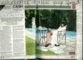


This is the other double page spread I deconstructed. I really liked the layout of this page and wanted to sort of combine both this layout and the above layout. I did this by having a large title, similarly to that of the Dizzee Rascal DPS. I thought this made the page look incredibly eye catching and original, as did the amount of pictures.
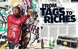
I liked the way in which instead of combining both text and images on the same page, the two double page spreads I deconstructed both had a page of text and a picture that took up an entire page. I therefore decided to do this myself. Both double page spreads made this effective by using eye catching and interesting pictures to take up their page. I therefore decided to do the same but in my own style, this is how I came up with the idea to have a 'photobooth' theme.


Q Magazine was very helpful when creating my double page spread as the double page spreads I looked at were very themed around the artists, helping to give me ideas for my own. For example, for the Lily Allen double page spread, it's clear to see the angle they've taken it from is that she is trying to change her original lower class and teenage look into a more sophisticated, mature look. Hence the entire layout of the spread is classy and formal. Similarly, the theme is the complete opposite for the spread on Dizzee Rascal, keen to keep his 'grime' image, appealing to a younger audience by decorating the page with graffiti and bright colours.

I therefore did the same with my own, my artist keen to keep her dignity and sense of togetherness in my article, therefore the page is calm and formally laid out. The page is also kept sophisticated and understated via the use of black and white. The youth of the artist has been kept however via the subtle uses of an original and subtle combination of pink and yellow, representing happiness and femininty. As well as this, I decided to make certain words of the title bigger than others, coordinating with the front page and keeping a sense of jumbled youth.

Creating My Double Page Spread

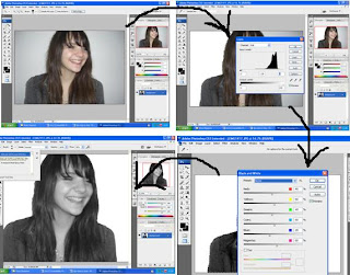
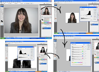
I began by opening my image in Photoshop, and using the magic selection tool to highlight the background surrounding my model.
Next, I selected Image > Adjustments > Levels and adjusted the dial to make the background completely white.
I then used the magic selection tool again to highlight the model and then selected Image > Adjustments > Black and White so as to make the model black and white!
I then selected the eye dropper tool and clicked my models face so as to get her correct (now grey) skin colour. I then selected the brush tool, and then the airbrush option and used this tool across my models face to even out any imperfections.

To prevent the used of the brush tool looking too obvious and unnatural, I selected Edit and then Fade brush tool, and adjusted the dial to help it blend and look more natural.

Using the brush tool again I chose the colour black and brushed it across my models eyelid, to make her look as though wearing more make up. Again I repeate the before step, selecting Edit > Fade brush tool and adjusting the opacity to make it look more natural.

Next, I again selected Images > Adjustments > Levels and edited the levels so as to make my models face look brighter and more 'glowing'.

I then cropped my image by selecting the crop tool, dragging the it across the part of the image I wanted to keep and then right-clicking the image and selecting crop to get rid of any excess background and keeping the main focus on my model.
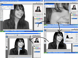
I then began to edit my next image. As before, I used the magic selection tool to highlight the background and repeated the steps to adjust the levels and make my background white.

Again, I made my model black and white by selecting Image > Adjustments > Black and white.

To make my models face bright as I did before, I selected Image > Adjustments > Levels. I then edited the levels even more than I did before so as to make it look as though the flash of the camera had brightened her face. I did not do this on the last image because focal points such as her eyes were closed and I did not want to wash out the features of her face.

To help my models eyes stand out, I used the magic selection tool to highlight her pupils and then adjusted the levels as before but in the opposite
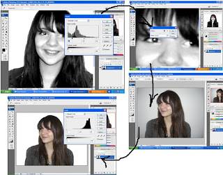
direction to make them darker. I then repeated the before step of adding a black line on my models eyelid to help it stand out and make her appear to be wearing more make up, using the brush tool. I then sleected Edit > Fade brush tool so as to make it look more natural.

I then opened up my next chosen image into Photoshop and began editing it in the same way as the last two to help them coordinate.

Again, I began by using the magic selection tool to highlight the background, and then selected Image > Adjustments > Levels and then adjusted the dial as before to make my background white

I then selected Image > Adjustments > Black and white again to make my image black and white! I then selected Image > Adjustments > levels and edited the levels to make my model look as though the cameras flash had brightened her face.

I then repeated this step, using the magic selection tool to highlight only her lips and moving the dial in the opposite direction, thus making them darker and helping them to stand out.

I then cropped my image as before so as to get rid of any excess background.

I put my images into InDesign by creating a new blank document of three pages so that I would have two conjoined pages for my spread. I began by selecting the picture tool box and dragging it into a box about the size I thought I would need. I then selected File > Place and selected my first image.

To make my image fill the frame properly and proportionally (withouth it coming out b lurry and overstretched) I selected Fitting > Fill Frame Proportionally.

To begin editing my next photo, I again used the magic selection tool to highlight the background and then selected Image > Adjustments > Levels and adjusted the dial to make the background white.

Again, I adjusted the levels to make my models face look bright and as if lightened by the camera flash.
Next, I selected Image > Adjustments > Black and white. I then selected the eye dropped tool to get the correct colour of my model and then used the brush tool > Airbrush and evened out my models complexion!


Having completed editing this photo, I continued to add each image into my InDesign document, using the same method as before (File > Place > Choose Image > Right-click > Fitting > Fill frame proportionally). I created margins/guidelines on the page by clicked on the rulers on both the left hand side of the page and the top of the page and dragging them down to the position I wish for them to be in, thus creating a light blue guideline.
This helped me position my images in a neat and tidy fashion with all the images the same size.


I then created a guideline for where I wanted my text (I wasn't completely sure how much space I'd need so just used it as a guide). I had previously written a draft for my article which had then been approved by my teacher. I opened the final document in Word, dragged the cursor across it to highlight all of the text and then right-clicked and selected copy. I then inserted a text box in InDesign and dragged it across the space I had allocated as a guide. I then right-clicked within the text box and selected 'paste'. The text was automatically inserted into the first column. To evenly distribute the text evenly throughout the rest of the columns I selected the small red icon that appeared at the bottom right hand corned of the column filled with text. I then clicked on the next column and repeated this step, thus evenly distributing the text!

Next, I inserted another text box in the space allocated as a guide for my title and subtitle. I inserted within the text box a quote from my article, thus giving an indication to my readers of the nature of the interview.
I then began to play around with the title, changing the font and font size, editing the height and width and trying to get it into a position and layout where I felt it looked best.
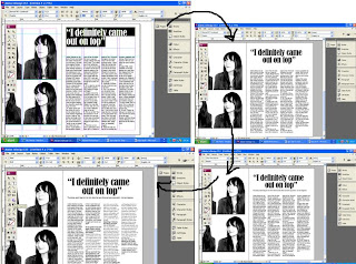


I began by making the title the same font used for the quote on the front page so as to make the two coordinate and also to show a link between the two. I then centred the quote/title to give it the appearance of actually being a title and to tidy the page up. I did this by changing the paragraph alignment of the text using the text options.

I then inserted another text box beneath the title and inserted my short description of the article. I did this in another text box so that I could change the positions of the two different text boxes to create a different layout should I decide to. I then highlighted the questions in the text and made them Bold using the text options so as to indicate that they were the questions and the text that wasn't bold the answers. I also did this to separate the two and prevent them from blending into one big chunk of text and making it difficult to read/understand.

I separated the introduction at the beginning of my article so as to make the page neater and the introduction easier to read.

I then changed the font of the title because I felt the original font to be too chunky and bold to suit a fairly long piece of text, I therefore chose a similar, yet thinner font (Georgia). I did the same for the description beneath the title, helping them coordinate and again helping the page stay neat and tidy.

I inserted my chosen 'red carpet' image of my model, which I edited in the exact same way to how I edited the other images on the page (bar editing the levels to give her face a bright shiny look since this suggests happiness and health - something I did not want this image to convey, instead I only edited the levels slightly to give the impression of a camera flash)

I then separated each Q&A by pressing the 'enter' key beneath the end of each chunk of text. This helped to make my page easier and simpler to read, as well as making my page a lot tidier and professional looking.

In the same way to how I centred the title, I centred the description beneath the title to help the two align and look neat and tidy. I also inserted the text saying who wrote the article and who did the photography (both me of course!). I inserted this text as part of the title so as not to make it stand alone and steal attention, yet by putting it next to the title it is pretty much impossible to miss - so people know who did the text and writing and know who to contact should they wish to use my services!

I then inserted a black line at the top and bottom of the page as as to create a neat and simple border. In the left hand corner of both pages I inserted a small 'B' in the same font as the front covers masthead, creating a 'Blast' logo, and 'stamping' the spread with Blasts name so that the content is exclusive to my magazine. I also included the month and year of the issues release for future reference, both features create a professional look to my spread.

Similarly to my front page, I made certain words of the title bigger than others, simply to highlight important words such as 'definitely' and 'on top'. This also gives a certain message to the reader of the way in which the interviewee said these words.

Next, I highlighted the speech marks and adjusted the colour of them by selecting the colour panel. I spent a lot of time trying to work out which colour and what shade to use, experimenting with similar colours to that of my front page. However, since this page is supposed to be emanating the subjects new found happiness I decided blue (the connotations being cold and sadness) was not the right way to go. I instead settled on a yellowish pink, the combination of both having connotations of both femininity and happiness (pink being feminine, yellow being happiness). Both these colours also suggest springtime - ideal for a March issue. I decided only to make the speech marks colourful because I wanted to keep the black and white theme. I experimented with other features being colourful but the addition of too much colour looked tacky and too young for my target audience. I also added a line beneath the title and made it the same colour as the speech marks so as to coordinate. I did this by using the line drawing icon (the same way I created the border) on the toolbar. I did this so as to make the page look more neat and professional and also to seperate the title and description from the actual article.

Having been compressed into a narrow column, a lot of the words in my article had been separated then hyphenated to rejoin. To get rid of this, I highlighted all the text and then clicked on the small paragraph symbol, I then scanned the navigation bar and unchecked the word 'hyphen' so as to get ride of this. I did this because when hyphenated, the text looked both untidy and unprofessional - neither of which did I want for my magazine!

I then finished by making small changes such as moving the piece of text where I credit myself with both the images and words, simply to make the page look better!

Feedback from other students really helped me to decided what colour looked best for my speech marks since I was unsure of what colour looked best. Asking about the appearance and layout of my DPS really helped too as it was nice to receive reassurance regarding the appearance of my product. Everyone I asked was happy with what I produced and I asked them questions about it based on the title and whether they thought small things edits such as the font was suitable and the images looked good. There were no suggestions on how to approve my page and so I left it how it was!


My Final Product

Attracting My Target Audience

Creating a reader profile really helped me create a product suitable for my target audience. After conducting a survey to collect information on my audiences main interests and preferences in a music magazine, I was able to include the features my audience were really interested in.

As before mentioned, my female audiences main interests were fashion, gossip, reviews, latest releases and events, whereas my male audience were purely interested in reviews, events and latest releases. Since events, reviews and latest releases were common ground between the two, I made sure to include them in my magazine.

I included this on the front cover to appeal to my target audience since they are interested in both reviews and latest releases. This feature includes both these two features combined, so I felt it was an interesting and more original way of combining the two to create an interesting article for my readers.


In my survey, I asked my audience to provide me with their favourite artist. I then took down the main answers :


  • Beyonce
  • Rihanna
  • Jay Z
  • Kanye West


Unfortunately the USB stick with my survey results graphs is not actually
letting me open anything that's been saved on to
it! I did however manage to recover two of the graphs - this being one of them!


I included the first three artists on my page since they are very much in the music headlines at the moment. I discluded Rihanna however because she is currently more associated with pop, so I chose to only include those strictly associated with urban music. I added artists 'Alicia Keys' and 'LMFAO', since my reader profile states that my audience are interested in long runnning artists - (Alicia Keys) and I included 'LMFAO' since they are very new and current, helping to appeal to my young audience and to add a contemporary feel to my magazine as well as showing it is up to date. Since this band are frequently involved with techno and therefore club music, they will appeal to my audience who as before mentioned, spend a lot of their money on nights out and will therefore have heard of them. These artists have also recently been in the charts with new releases, helping to appeal to my audience who are very interested in this topic.


Due to the fact that my female audience wanted some gossip in their magazine, but the men did not, I decided to include 'News' instead. This implies that the article is not on gossip, but is instead on a level of importance, what's been going on in the celebrity world. Since the connotations of 'gossip' are typically feminine, I restrained from using that word so as not to close of my male audience. The word 'News' implies some gossip, or rather gossip would not be out of place on such a page, yet also implies importance and men reading it will not feel imasculated by the connotations of the word, therefore appealing to both male and female.

So as to appeal to my female audeince, I included a segment on an 'artist', since according to my reader profile, my female audeince enjoys hearing about the meanings behind the artists songs and their love interests, I included the description 'her life, love and music' - all things my female readers want to know about.

My main article is about an artist named Amber Martina. Since celebrity gossip was not high on the list of importance, I did not write the article on gossip and instead made it more about the artist promoting her new album, whislt having some information on her life (my main story included the fact that she had been through a break up and had not been in the limelight for her music for a while - my interview covers how she is feeling now and her plans for her new album). By including some gossip, yet more about her new album, I appeal to my male and female readers since it is more about latest releases, inspiration for these releases and still has a bit of gossip for my female readers.

Since fashion articles were high on the list of importance for my female readers, I included a seciton on fashion. I entitled it 'The Blast Look' since both readers like to follow fashions whilst stll being individual. My readers can therefore relate to this since it is as though my magazine is creating its own style - similar to my readers. Although my male readers were not that bothered by fashion articles, I included this anyway since according to my reader profile, my male audience is very interested in appearance. Both male and female enjoyed spending money on latest brands and fashions, hence I included a 'Brands' secion (the lack of description suggesting this is a regular feature), to appeal to both male and female. I also included a section on how to look good this Spring (obviously referring to the most latest trends), appealing to both genders.


I included releases and reviews in a section that suggests that they are regulars, showing readers that these are the kind of features to expect from this magazine, encouraging them to buy in the future. For 'Hot or Not' - the latest releases reviews section, I made it so that it was the readers views as well as the magazines on the releases. By doing this, I was able to make room for a potential website feature where readers can access the site and include their own views, encouraging reader participation and an expansion in media.


I included events in a section that was only relevant to that months issue ('This Month') so as to show that this section may change every so often slightly (different themed events etc.).

Target Audience

The target audience for my music magazine is both male and female, aged about 18-25. To portray my target audience in my scrap book, I created a reader profile depicting my audiences interests, fashion style, favourite retailers, drinks, food and cosmetics.

My male reader will spend most of his money on the latest technology, music, nights out and fashion. My male reader will care a lot about what his clothes and music taste say about him, his appearance being of high importance in his life.

On nights out, my male reader will drink anything he can afford and will guarantee a good time, his favourite beer brand being Fosters. His favourite music genre is rap and R&B, he idolises the artists of this genre whose lifestyles typically consist of sex and money.

My male reader makes sure he is always equipped with the latest technologies, from games consoles to mobile phones. His favourite past times being using these technologies, watching films, listening to music, drawing and being with his mates. He prides himself on the fact that he does not listen to what is popular these days and will only listen to what he decides he likes, a lot of these songs being by older and perhaps less appreciated artists.

He is currently a student, his favourite subjects being art - he's very creative. In his free time he may work in a record store, helping him to keep up with what he is most interested in. He will spend this money on clothes, holidays, music and technology. He holidays in places such as Ibiza where he's guaranteed a good time with his mates. Since he looks after his appearance he is not a fan of junk good, but should he decide he's in the mood he goes for places such as Subway as opposed to McDonald's and KFC.

Having conducted a survey, the majority of the men who filled in my questionnaire where mainly interested in reviews and events being in their magazine. They were more interested in a weekly magazine and were willing to spend between £1.00 and £4.00 on this magazine. All but one rated reviews as the most important feature of a music magazine and had no preference on the colour scheme of the magazine, their main request being that the cover be quite 'loud'. Second on my male audiences priorities for the magazine was event information, hence I tried to include both the advertisement of reviews and events in my contents page, to help cater to their needs and keep my audience interested.

My female reader also spends most of her money on nights out and in shops such as Topshop and Urban Outfitters. Her main style is eye catching and alternative, her main style icons being Rihanna and Cheryl Cole, her fabourite make up brand being MAC. Whilst she's individual, she is also heavily into the latest fashions.

On a night out, she drinks Vodka and Red Bull and is the life and soul of the party. She enjoys street dance and listens to R&B and other urban music such as rap. She likes to dance on a night out and look good whilst doing it, being interested in both her own and others appearance. She spends her money on good quality and well established brands and expects the most from what she's buying.

Similar to my male reader, she likes to have all the latest technologies such as MP3s and phones. Whilst she enjoys hearing about the meanings behind her favourite artists music, she is not interested in gossip about her favourite artists and is instead more interested in their music - a big part of her life.

Jess also spends her summers holidaying in destinations such as Ibiza with friends. In her spare time she dances, listens to music, and being a student, studies. Whilst she may be a student, she ensures she can buy such luxuries as the latest products and clothes by working over the weekend - probably a retail shop. My female reader, like my male reader, looks after herself and will steer clear of junk food.

My female audience were mainly interested in reviews and event information similarly to my male reader, the only difference being that they also rated both fashion and gossip articles as quite high on their list of importance. I therefore decided to incorporate this into my magazine so as to appeal to my female readers as well as male.

Both my male and female readers are likely to be single and enjoying their freedom.

Friday, 16 April 2010

Media Institutions

My music magazine would be most likely to be published by Bauer Media. This is because they back such radio stations as Kiss and The Box. These radio stations play music of my music magazines genre, making both my magazine and them very closely related. This company also backs music media that represent very specific genres of music, similarly to my magazine.

Bauer Media also represents such magazines as Pop, although mine is a music magazine, not an art magazine, mine is laid out very much liek such a magazine. Mine is very modern and this fits in well with the other magazines backed by Bauer Media. Similarly, my magazine is aimed at an audience made up of teens and young adults, its age group being 18 - 25. A lot of Bauer Medias magazines have a similar target audience, for example

These magazines are all aimed at late teens and early adults. The only different between my magazine and those backed by Bauer Media's is that they are most frequently aimed at either men or women and mine is at both. However, the magazines with a more specific genre such as transport and photography do not have specific gender audiences. Since my magazine has a specific genre, I feel this would help it fit in even more.

This production company is very closely related to large music companies such as the before mentioned Kiss and others such as 4Music. Since mine is a music magazine, this is almost the perfect company for it since it has close relations with other large and established music brands, www.bauermedia.co.uk/brands.

Retailers such as W H Smiths would sell my magazine. This is because although my music magazine has a specific urban genre, it is aimed at a fairly wide audience due to its mixed gender. W H Smiths sells similar magazines such as NME, Clash and Mixmag who, whilst following a specific genre, have a fairly wide audience, like my music magazine. Hence, W H Smiths would be the best place to sell my magazine, amongst these others. This would also add diversity to their stock since the music magazines they already sell include NME - an indie/alternative magazine and Mixmag - a dance magazine, none of their stock includes urban magazines such as mine (avoiding selling my magazine amongst its competitors). My target audience are the age of most students, hence they may find themselves in such a shop in a frequent basis since it stocks the necessities needed for such a person.

My reader circulation, judging by the magazine on the market mine is most similar to - Vibe - will be 836,611.

To help market my magazine, I would propose a website including such features as music and video links, including the latest urban releases and the opputunity for users to rate and leave their thoughts on said latest tracks. This would add to my reviews and latest releases feature of my magazine as people would be able to read about the latest tracks then visit the website to actually hear them. As well as this, one of my features 'Hot or Not' - the readers thoughts on the latest releases would benefit greatly from a featuee that enabled my readers to leave their thoughts that could be easily accessible.

Magazines such as Vibe have websites including similar features including a music page where users can access both the latest tracks and videos www.vibe.com/music. As well as this, it features any stories relevant to music such as what artists have said about their new tracks and other thoughts on music and recent stories surrounding the artists including interviews.


However, on my website I would just have latest releases and the oppurtunity to hear them in the music section. Again, I would also have a video section in which users can view the videos for the tracks.


On Clash magazines website, they have a gigs section (www.clashmusic.com/gigs) which allows people to view upcoming gigs and gives the opportunity to buy them. I would also include a feature for events, since this was voted one of the most important things as far as my audience are concerned. Similarly to the Clash feature, this events catagory would allow people to book tickets and access information and websites key to the events.

http://www.nme-magazine.com/, another music magazine website, includes the opportunity to subscribe to the magazine. It does not posess many features, unlike Clash and Vibe which both include reviews and artist information. This allows all the features to be within the actual magazine and the website is purely there for advertising purposes. I would follow this system. By including reviews and other features of my magazine on the website, I may discourage people from spending money on the actual magazine. Therefore, the music, videos and 'Hot or Not' and events features would be the only features on my website. They are there because they back up information in my magazine, encourage people to form their own opionion on whats in the magazine and allow me to recieve feedback to improve the magazine.

Since my magazine is monthly and NME is a weekly magazine and therefore would probably run out of information and articles if it included them on the website AND the magazine (although magazines such as Heat do this, but NME is a specific genre music magazine so there is less information and articles available), I will include information on upcoming information, to keep my audience going inbetween releases. For exmaple, I would include headlines from the next issue dotted around the homepage. This would not give too much away and would get people excited about the next issue, encouraging them to buy it. This would also be a modern feature, tying in with the theme of my magazine. Doing this would also be reminiscent of other media websites for films or shows which include quotes of approval that they have receieved. By doing this with headlines of the upcoming issue, I would create a nice effect and associate my headlines with approval - implying how good they are. Doing this would also make the release of my magazine similar to the release of a film whcih is obviously a lot more prestigious. This would 'big up' my magazine and make its release seem important and exciting.


For Example: This type of layout (on the slumdog millionairre website), the quotes appear on the screen when you first open the website. I would do this, but with upcoming headlines of the next issue.